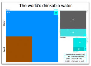
The world’s drinkable water
I’m a big fan of data visualization. Something about taking huge swaths of numbers and reducing them down to a set of conclusions or messages is very intriguing.
For a while, I’ve been consuming blogs and articles related to data visualization, so my head is full of theories with not much practice. So here is my feeble first foray into the dataviz space. The data comes from a post on flowingdata.com. It presents one way of looking at just how little water (percentage-wise) is available to drink and asks if there is a better way to depict the information. This is what popped into my head when I read the question, and hopefully that idea has translated well:
Any comments or suggestions are welcome.
Read other posts
